
You have the most incredible product in the world. And you’re trying to sell it in a neglected shop located out of nowhere with no signboard.
Nothing is shown or written in your window, inside the shop the same; you have an old table, you and your fantastic product. No wonder nobody notices the shop, you or your product.
Likewise, a landing page is your shop, where you introduce your product to your potential customers. And you should design it with best practices to sell your product.
After all, it’s the moment of truth and where your hard work pays off.
After your visitors land, you have a few seconds to make them stay and listen to your offer. If you don’t have the right triggers, they’ll be out forever.
To increase your conversion rates, you should know about those triggers. And in this article, we’ll give you a 13 point landing page checklist that presses all influential triggers. You’ll also
- Get an infographic (landing page checklist)
- Learn how to evaluate your landing page.
- Get to know about our favorite tools.
There are some lists on the internet with 50 point checklists. We find those lists absurd because they can only create confusion and anxiety with that many points.
It’s a simple subject. After reading this article, you’ll no more worry about your landing page structure and be able to create a high converting landing page.
Let’s start to count then to 14 then.
14 point landing page checklist for higher conversion rates.
#1 Clear Value Proposition
A clear value proposition is a short and compelling summary of the primary benefit that you offer to your prospects.
The attention span of a typical visitor is lower than a goldfish. So you should start talking about your visitor’s pain point and your offer in the very first phrase.
If you want to know how to tame a goldfish you can read this colossal article about how to write a value proposition. Or if you’re a visual learner you can watch it from here for free.
Your value proposition needs to answer these 2 questions within 5 seconds.
- Which product or service does this website offer?
- What is unique about this product or service?
Here are three things to outline before you write your value proposition.
- Know your ideal customer.
Her language, struggles and major pain points that make her upset.
- Specific and concrete benefits of your product.
Focus on one primary benefit and include qualitative or quantitative, measurable end results of your product.
- Unique Strength
What differentiates you from your competitors? Use your unique strength to convince your visitors.
You can use Buyers Challange Canvas to write compelling value propositions in an hour.
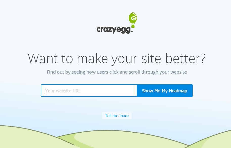
This one from crazyegg is a great example.
#2 Visual Focus
The background image of the first visual your visitors see. It’s a precious element, it would be a shame to waste it with a static image.
You can match your this visual with the value proposition to empower your message and grab your visitor’s attention.
Here are some ideas:
- If it’s a personal brand -> Show your face.
- If it’s a product -> Show your product with a happy customer, or show the ease of use or show the interface.
- If it’s a service -> Show happy customers, share a moment from the environment.
Think of how you can get through the feeling or end result of your product to your visitors.
Transferwise shows its visitors how simple it is to use the product.
#3 Short forms
Make your forms short and sweet for higher conversion rates. Ask for an email and that’s it, you have everything to start a conversation.
Long forms are scary, and in general, they have lower conversion rates. Try not to ask people their company, city, dog’s name and how many cousins they have, as long as it’s not a must.
#4 Call to actions
Right after you talk about their pain points and present your offer, call your visitors for action. Their attention span is short, so you should show the next step before they leave the page.
Blend your value proposition and call to action to make it more effective.
Avoid: “Click here” or “Contact us.”
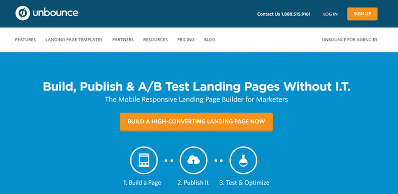
Instead, use: “Start building a landing page”. Or do it like Unbounce and make it more attractive and write “Build a high-converting landing page now”
Have a single focus call to action. If your product is too complicated, then you can have a secondary CTA, such as “Learn more about x.”
The design of your CTA is also critical. Try to find attractive colors that complement each other and make sure these colors are matching with your brand identity.
#5 Social Proof
People don’t know you. And the social proof is a shortcut to building an instant trust bond between you and visitors.
There are tens of social proof strategies, here are some of the most effective ones:
- Show how many people purchased your product – 3043 people bought this course.
- Written testimonials from your customers
- Video Testimonials. A happy customer could sale better than your best salesperson
- Badges. Such as security or trust badges.
- Logos. Show the brands you have worked with.
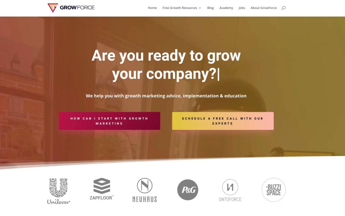
You can even fit logos above the fold as we have done here. You can check fera.ai if you want to add social proof to on your landing page.
#6 1:1 attention ratio
You already know that attention is the only currency you have. And you need to guide that attention to your offer, only, lonely. So you should get rid of all clickables, navigation elements, search bar and the rest of distractors.
Here, once upon a time, there were 22 clickable in Tentoo’s (one of our favorite customer) landing page.
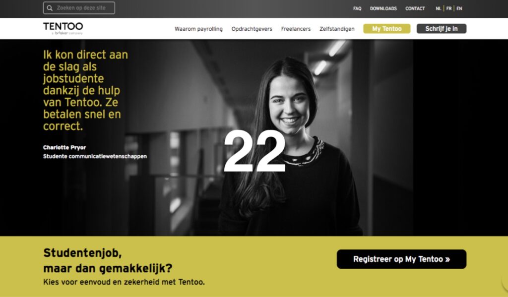
Keep the attention laser-focused to your holy goal: conversion.
#7 Make it personalized
Browse platforms like Reddit, Quora and specific forums to find out how your target audience speaks and writes. Then try to talk their language on your landing page.
For example: If your potential customers are millennials, you can use “gimme” instead of “give me” to make them feel like they’re talking with a friend.
They’ll easily choose a friend over your competitors.
Note: Never use complicated words when there is a simple alternative.
Try to keep your copy at the elementary level, it’s easier for the brain to understand even when it’s educated.
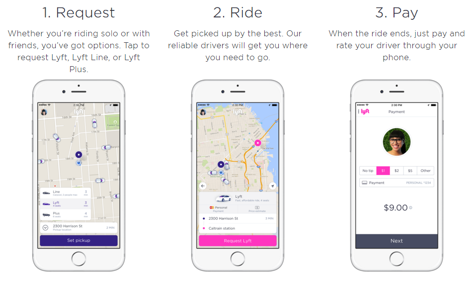
#8 Help your visitors by showing all the steps
You think your product is too straightforward and doesn’t need further explanation? Don’t leave a space for assumptions.
Show how people can use, configure or implement your product.
Even the most straightforward product needs a step by step explanation. Because these steps give your visitors a sense of security.
This step by step approach will give your visitors a gameplan after they purchase your product. You’re placing stepping stones to help them cross the river of doubt.
Use five or six steps at max. Otherwise, you may accidentally over complicate your product instead of helping them.
#9 Use bullet points to present your features or benefits.
I’ll make this one a live example for you.
Example 1.
With landing page software X, you can easily design your landing page by using templates and drag-and-drop features, so no coding skill needed. Also, you can A/B test and connect your landing pages to your favorite marketing tools to get the best out of it. If you have any problems, our customer’s support is on the line to help you, 7/24.
Ok, I confess I wrote it with no love to make it look worst.
Example 2
With X:
- No coding skills required.
- Design easily with a drag-and-drop feature.
- Use 100+ templates
- A/B test to find out what works best for you.
- Connect X with your favorite marketing tools.
- 7/24 fast online support.
You see, the first one is crowded and boring.
The second one is effortlessly flowing and snackable.
You know what is even better than that? Transforming the features to benefits.
To do this, you can sort all of your features and try to squeeze emotional benefits from each.
For example:
- No coding skills required – You’ll never be dependent on an IT guy who rarely keeps his deadlines.
- Use 100+ templates – With templates, you’ll save hours and instead, you can spend your time doing your favorite things.
Always use bullet points instead of long sentences to make your points concise and attractive.
#10 Page speed optimization
Here is a fun fact. People are annoyed if your page loads slower than 3 sec and then they bounce. And you’ll never see each other again.
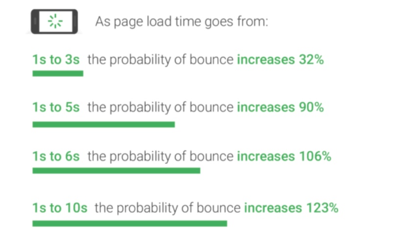
The speed of your landing page is a passive component but it’s super important for two reasons.
One: As we mentioned, you lost your precious visitors.
Two: It also gives you the upper hand to rank higher on Google search.
You can go there to find out your page speed.
Then you can follow the suggestions of Google to make your page faster.
#11 Clear communication (what, why, how)
Make sure that your visitor immediately knows what he can get (WHAT), how he can get it (HOW) and why he needs it (WHY).
You can map out the structure of your landing page with these three communications pillars. The order can be flexible for each product, but in general, it’s like that:
Why? You’re embarrassed because you have a sweating problem.
What? Sweatnot can help you to get rid of your sweaty palms.
How? You can buy it by clicking the CTA and start using it in three easy steps.
I know what you’re thinking and no, I don’t have a sweating problem.
#12 Mobile Friendly – Responsive
If there were a constitution of the landing pages, that would be one of the major laws. Seriously, triple check your landing page and optimize it for your mobile visitors.
#13 Create urgency
Scarcity increases the conversion rates but it needs to seem natural and rational. It’s a robust psychological trigger called loss aversion and also known as FOMO.
These days, almost everything is limited edition and available for a limited time, so be careful with how you’re using it.
#14 Repeating the call-to-action
Hey, do you remember me? It’s me again, call to action and I’m here to transform you to into a customer.
No jokes here, Don’t hesitate to repeat your CTA 2 to 3 times more on your landing page. Your visitors could get distracted and drift away without clicking your call to action.
So add some more action.
So what does my landing page has to look like?
If you follow this scheme, your conversion rates will increase and you’ll be a happier person.
- Header
- Value proposition
- Matching visual
- Tagline
- Form
- Call to action
- Section 1
- Description + video if possible
- Section 2
- How to use the service or product
- Section 3
- Social proof
- Section 4
- Call to action -> link to the header.
How can you evaluate your landing page?
1.Five seconds test.
In this test, you’ll show your landing page to your friends, colleagues, friends, family members and even strangers and ask them to answer these questions:
- Which product or service does this website offer?
- What is the unique thing about this product or service?
Here are the steps:
- Find a volunteer.
- Open your landing page.
- Show them the page.
- Count to five (Sssh, don’t do it out loud, they only have 5 seconds)
- Ask them the questions.
You can start browsing famous brands’ websites to understand how effective this strategy is.
2. UsabilityHub
Ok, I hear you, you may not have that many (unbiased) people around. That’s why you have UsabilityHub.
UsabilityHub is a tool that helps you to show your value proposition to a digital crowd and it’s identical to the five-seconds test. Additionally, you can add more questions.
Landing page tools we love to use
Instapage: An end-to-end, drag-and-drop landing page tool with built-in analytics. Even a blind squirrel could build above average landing page without any help. It’s on a bit pricey side but worths every buck
Unbounce: Get more leads, sales, and customers with landing pages built just how you want in Unbounce’s drag-and-drop builder.
Now you know what to do with your landing page checklist.
You made it (the reading part). Now go on and create or optimize your landing page when everything is still fresh and bright!
Ah, to save you from the torture of scrolling up and down, we also prepared a landing page checklist sheet. You can download it and save yourself from sliding between paragraphs.
If you enjoyed reading, learned something or cracked a small smile while you’re reading let me know in the comments!


Yigit
Head of Content
I’m here to make sure you enjoy every bit of content you read.